Is it just me, or do modern logos seem a bit plain and generic? It’s a common sentiment these days. We often find ourselves reminiscing about the cool and intricate logos of the past, wondering why companies are opting for simpler designs. But there’s more to modern logo design than meets the eye. In this article, we’ll explore the fascinating reasons behind the shift towards minimalistic and straightforward logos. So buckle up and prepare to uncover the secrets of modern brand design!
Evolution: From complex to minimalistic
Over the years, graphic design has undergone significant transformations. As businesses adapt to the changing needs and preferences of consumers, their logos also evolve. The once complex and intricate designs have given way to simplicity and minimalism. But why? Let’s delve into the top 8 reasons why modern logos look the way they do:
1. Emphasising simplicity for users
One of the primary reasons behind the simplicity of modern logos is to make them easily recognisable and memorable for consumers. In a world filled with information overload, businesses aim to reduce the cognitive load on users. By stripping away unnecessary details and employing plain colours and distinct shapes, logos can be instantly identified at a glance. The idea is to create a logo that doesn’t require much thought, allowing it to leave a lasting impression on potential customers.
2. Consistency across platforms
Logos now appear on various platforms, ranging from billboards to mobile screens. To ensure a consistent brand image, logos need to adapt seamlessly to different mediums. A simpler logo design is less likely to appear distorted or out of place, regardless of where it is displayed. Consistency is key to brand recognition and credibility, and a minimalist logo design facilitates this.
3. Cohesion with other brands
Collaborations and shared spaces between brands are becoming increasingly common. Think of your smartphone’s home screen, where multiple logos reside side by side. If a logo stands out too much and deviates significantly from the surrounding brands, it can be distracting and even off-putting for users. It’s crucial for logos to align with the overall aesthetic and style guidelines of the environment they are placed in, ensuring a seamless and harmonious experience for consumers.
4. Enhancing memorability
With the constant bombardment of information, our brains are selective about what they retain. Companies understand this and strive to create logos that are easily memorable. By removing extraneous elements and focusing on simplicity, businesses increase the chances of their logos sticking in the minds of consumers. The goal is to have the logo associated with the brand every time a related product or service comes to mind.
5. Synergy across products
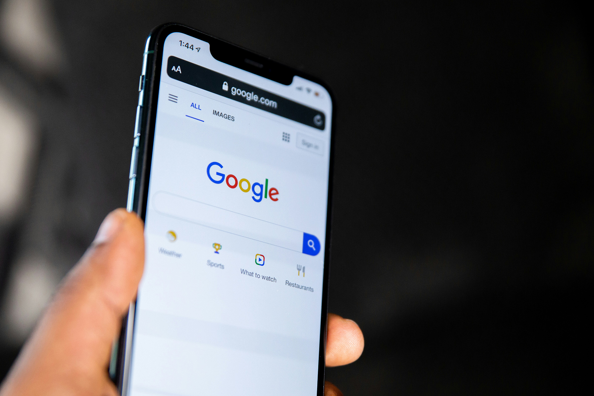
Companies strive to create a cohesive brand experience across their products and services. A simple logo design allows for easy incorporation into various products without overwhelming their individual designs. Take Google’s branding, for example. Their logo consists of five distinct colours, which are used consistently across all their offerings. This instantly establishes brand recognition and strengthens the connection between the logo and the products it represents.
6. Legibility and accessibility
Inclusivity and accessibility are important considerations in modern design. Logos need to be legible and easily understood by diverse audiences. By embracing simplicity, logos become more accessible to individuals with varying abilities. Whether it’s someone with visual impairments or individuals who process information at different rates, a simple logo design ensures that everyone can engage with the brand effortlessly.
7. Fostering imagination
Sometimes, less is more when it comes to engaging the imagination. Intricate logos with detailed illustrations may limit the viewer’s ability to interpret and connect with the brand. By simplifying the design, companies leave room for individuals to fill in the blanks with their own imagination. This allows for a deeper personal connection and resonance with the logo. A smiley face, for example, can evoke a range of emotions and associations, making it relatable to a broader audience.
8. Adapting to changing times
As technology advances, our interactions with logos have evolved. In the past, logos primarily appeared on billboards, print advertisements, and physical products. Now, with the dominance of screens, logos are predominantly viewed in a digital format. This shift in viewing platforms necessitates a change in design philosophy. Simple and subdued logos are better suited for digital screens, ensuring optimal visibility and impact for users.
Unleashing the power of simple logos
In conclusion, modern logo design is far from boring. It is a carefully crafted response to the ever-changing needs and preferences of businesses and consumers alike. The simplicity of modern logos serves multiple purposes, from enhancing recognisability and adaptability to fostering imagination and artistic interpretation. By embracing minimalism, companies can create logos that leave a lasting impression, maintain consistency across platforms, and resonate with diverse audiences.
Are you looking for a stunning website to complement your brand’s new logo? Look no further! Metal Potato specialise in creating visually appealing and user-friendly websites that drive results. Feel free to get in touch to discover more about the range of services we offer and how we can assist you in achieving online success.
Let's make a website!
Book a FREE video call to discuss your business, project strategy, and more!
"*" indicates required fields
More from Metal Potato
How to Write SEO Content That Converts
How to craft SEO content that climbs rankings! Strategies for keyword targeting, readability, and engaging writing techniques.
Contact Page Design: A Blueprint for Success
Learn how to optimise your contact page for better engagement and conversions with expert tips and inspiring examples.
Why Your Website Isn’t Showing Up on Google
Discover why your website isn't showing up on Google and learn actionable solutions to boost your visibility!
How Google Remarketing Rescues Lost Customers
Revive lost leads with Google Remarketing! Target engaged visitors, boost ROI with personalised ads across Google platforms.
Unmasking SEO Scams and Safeguarding Your Website
Guard your business against SEO scams! Uncover deceitful tactics, red flags, and empower your online success with our tips.
How Often Should You Blog?
Optimise your blog's success with the perfect posting frequency! Learn to balance consistency, quality, and engagement for organic growth.


