The year was 1440, and what we would know now as the modern printing press had just been invented. So, too, had the world’s first serif typeface. You know, the swoopy letters that look like Times New Roman.
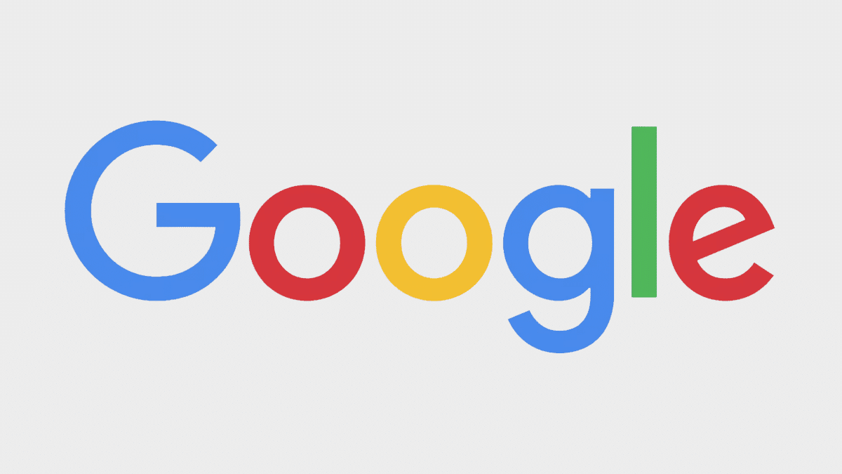
For 500 years, that typeface has been the workhorse of print media. But digital media, for decades, has relied on a different typeface: the sans-serif font. It’s easier for computer screens to produce, easier for people to read, and an all-around younger typeface (first appearing in the late 1700s). It’s a strange wonder, then, that for almost 20 years, Google’s logo rested on the laurels of a 15th-century font.
No more.
This week, Google rebranded with a completely new identity. And this time, they used the font of the future.
Kudos to you, Google. At Metal Potato, we’re big fans of a less-is-more approach to design, and you’ve just hit the nail on the head. Google, we’re hoping your changes lead to an even easier to read internet for all of us. After all, your new look is sure to subliminally influence millions of minds every day.
That’s a little creepy, but so is your humanoid, forest loving robot.
And regardless of the future direction of robotics, androids and the demise of human civilization as we know it, we’re glad that you’ve made at least one step towards making society a little more civilized this week. Less is more. Simple is elegant, and elegant is beautiful.
Now, if you could just make a Metal Potato Google Doodle, we’d be in business…
Feel free to get in touch to discover more about the range of services we offer and how we can assist you in achieving online success.
Let's make a website!
Book a FREE video call to discuss your business, project strategy, and more!
"*" indicates required fields
More from Metal Potato
Can Apple Vision Pro Revolutionise Computing?
Discover the Apple Vision Pro: a mixed-reality headset set to redefine computing, work, entertainment, and education.
How to Choose the Perfect Typography for Your Website
Master the art of web typography... from font selection to readability, create a visually stunning and user-friendly website.
The Power of WordPress for Small Businesses
Build a strong online presence for your small business with WordPress! It's easy to use, SEO-friendly, and very cost-effective.
Celebrating 40 Years of the Apple Mac
Explore 40 years of Mac evolution! Celebrating Apple's iconic computer and its impact on design, technology, and creativity.
Why LinkedIn Should Be Your Top Priority
Maximise career growth with LinkedIn's powerful benefits! Unlock networking opportunities, connect and build your personal brand.
7 Strategies to Build Customer Loyalty
Elevate your brand with proven strategies for customer loyalty. Personalised programs, consistency, and gratitude that resonate.
