Creating a contact us page that effectively engages your website visitors is crucial for converting them into loyal customers. While many businesses focus on designing their home page, product pages, and blog, the contact us page often goes overlooked.
In this article, we will explore the top tips and best practices for designing a killer contact us page, along with inspiring examples that will help you create a contact page that stands out.
How should your contact page look?
Before we delve into the tips and examples, let’s discuss how a contact page should look. There are several key best practices to consider when designing your page:
1. Avoid a distracting sidebar
To ensure that your visitors focus on the main purpose of your contact page, avoid cluttering it with distracting elements such as sidebars. Keep the page clean and centered around the contact form to guide visitors towards completing the desired action.
2. Limit form fields
Make sure your form only asks for essential information. Long forms with numerous required fields can significantly decrease conversion rates. Simplify the form by including only the necessary fields, such as name, email address, and message.
3. Represent your brand
Your contact page is an opportunity to make a positive first impression and establish a relationship with your visitors. Design your page in a way that reflects your brand’s unique style and identity. Use consistent branding elements such as colours, fonts, and imagery to create a cohesive user experience.
4. Provide clear instructions
When visitors land on your contact page, they need clear instructions on what you expect them to do. Clearly state the purpose of the page and guide them through the process of filling out the form or choosing alternative contact methods.
Now that we have covered the essential design principles, let’s explore what elements you should include on your contact page.
What to include on your contact us page?
While the specific content of your page may vary depending on your business and industry, there are a few key elements that should be present:
1. Contact form
The most important element is the contact form itself. It should be easy to locate and prominently displayed. The form should only include necessary fields, keeping it simple and user-friendly. Make sure to include a clear call-to-action that encourages visitors to complete the form.
2. Copy that matches your brand
The copy on your page should align with the tone and style of your brand. Use language that resonates with your target audience and conveys your brand’s personality. Keep the copy concise, informative, and engaging to capture visitors’ attention and encourage them to take action.
3. Social media details
Include links to your social media profiles to provide visitors with alternative ways to connect with your brand. This allows them to engage with your content, follow updates, and reach out through their preferred social media platform.
4. Additional contact options
Depending on the nature of your business, you may want to provide additional contact options such as a business phone number, physical address, or map for those who prefer traditional methods of communication. Including these details adds credibility and accessibility to your contact page.
While these elements are essential, you have the flexibility to customise your page according to your specific needs and preferences. Now, let’s explore some inspiring examples of well-designed contact pages to spark your creativity.
Inspiring contact us examples
1. WPForms
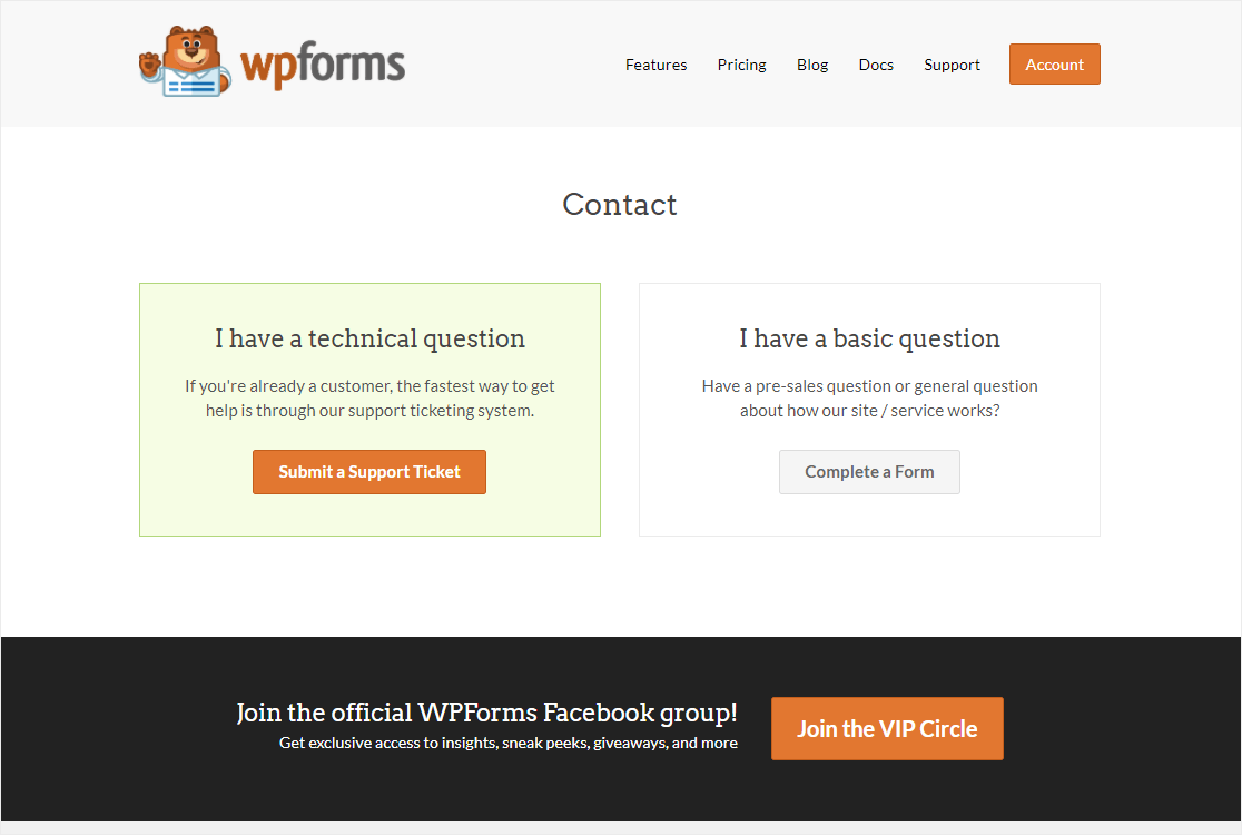 WPForms showcases an excellent example of a contact us page for small businesses. Their page is divided into two sections, catering to existing customers and presale queries.
The contact form is initially hidden, only appearing when visitors click on the relevant button. This segmentation helps direct visitors to the appropriate contact form and improves the user experience. Additionally, they include a call-to-action to join their VIP Circle, further engaging their audience.
To create a contact page like WPForms:
- Implement a contact form popup that appears when a button is clicked.
- Create a wiki knowledge base to provide customer service for existing customers.
2. Marie Forleo
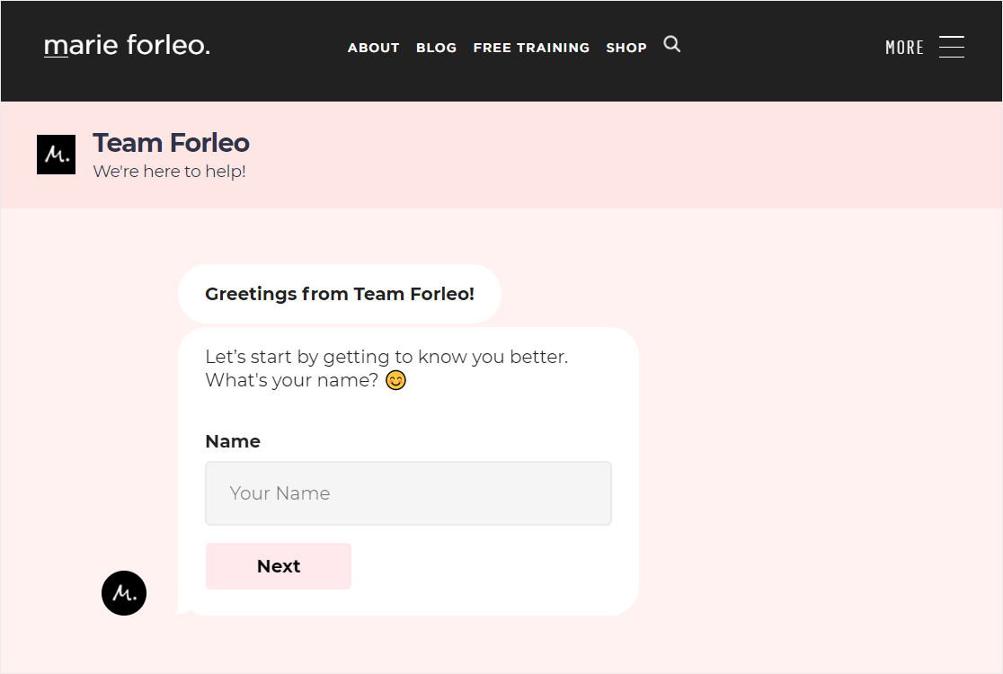 Marie Forleo’s page acts as the gateway to their support section. Instead of immediately encouraging visitors to contact them, they provide options for finding answers to common questions. This approach streamlines the support process and enhances the user experience.
To create a contact page like Marie Forleo:
- Use conversational marketing to create an engaging user experience.
- Employ a friendly tone and verbiage that matches your brand.
- Implement chatbots and live chat for real-time assistance.
- Optimise the page by removing distracting sidebars.
3. Legalia
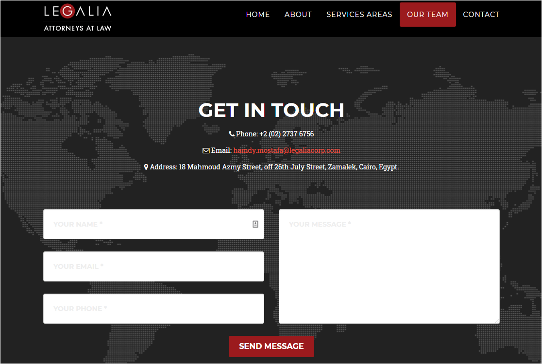 Legalia utilises a multi-column form layout on their page to save space and enhance the user experience. They also provide details such as their office addresses, phone number, and email address, increasing accessibility for their audience.
To create a contact page like Legalia:
- Utilise a multi-column form layout to optimise space.
- Include relevant contact details to facilitate communication.
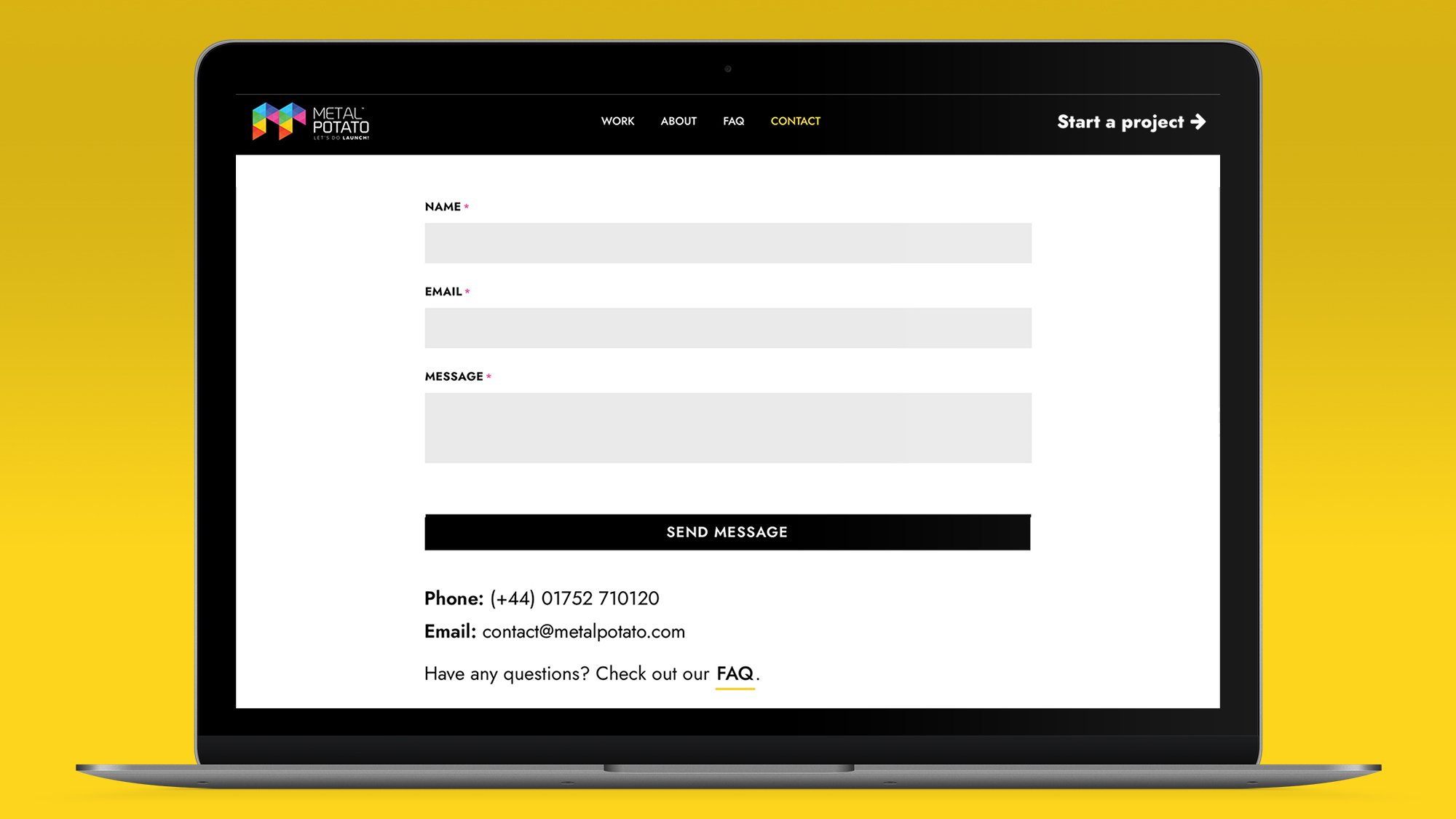
4. Metal Potato
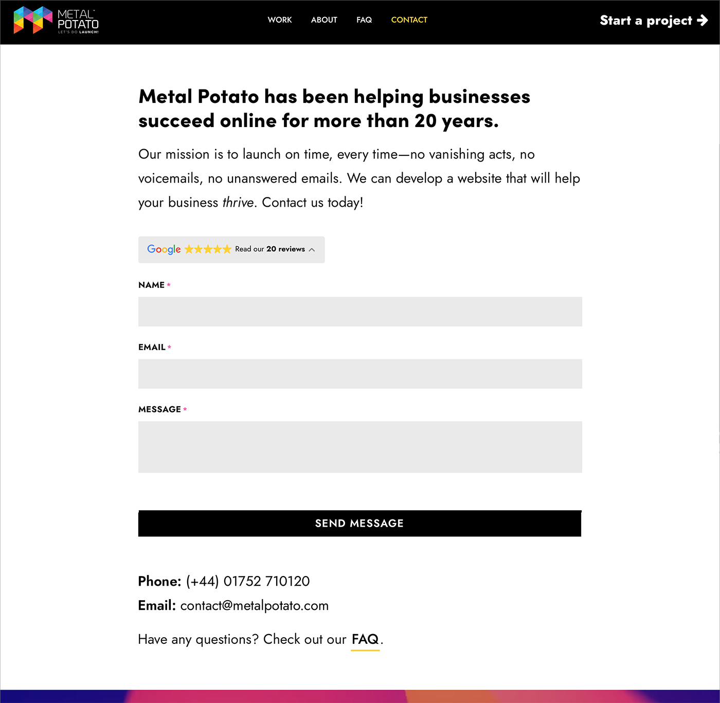 Metal Potato’s contact page is designed with simplicity in mind, showcasing a prominent contact form at the forefront. You’ll also find our phone number and email address, giving potential customers the flexibility to reach out through their preferred means.
Our page also offers convenient access to FAQs and the option to view past Google Reviews, enhancing transparency and credibility.
To create a contact page like Metal Potato:
- Prioritise a concise and inviting web form as the focal point.
- Clearly present alternative contact options.
- Enhance credibility with social proof elements.
5. JetBlue
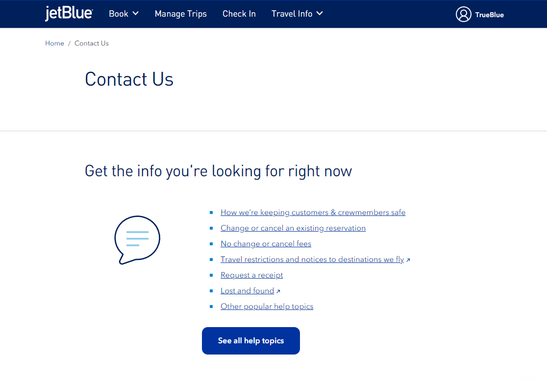 JetBlue’s contact page offers direct links to popular help topics and answers. While they don’t use a contact form, they provide alternative contact options such as email and phone. One improvement they could make is incorporating a form to cater to users who prefer that method of communication.
To create a contact page like JetBlue:
- Create a FAQ or knowledge base on your website.
- Consider integrating a contact form for a more comprehensive user experience.
Final thoughts
Now, it’s time to create your own killer contact page and start building meaningful connections with your visitors. Get in touch to discuss your web design needs and take the first step towards a successful online presence.
Let's make a website!
Book a FREE video call to discuss your business, project strategy, and more!
"*" indicates required fields

How to Write SEO Content That Converts
How to craft SEO content that climbs rankings! Strategies for keyword targeting, readability, and engaging writing techniques.

Why Your Website Isn’t Showing Up on Google
Discover why your website isn't showing up on Google and learn actionable solutions to boost your visibility!

How Google Remarketing Rescues Lost Customers
Revive lost leads with Google Remarketing! Target engaged visitors, boost ROI with personalised ads across Google platforms.

Unmasking SEO Scams and Safeguarding Your Website
Guard your business against SEO scams! Uncover deceitful tactics, red flags, and empower your online success with our tips.

How Often Should You Blog?
Optimise your blog's success with the perfect posting frequency! Learn to balance consistency, quality, and engagement for organic growth.

10 Proven Ways to Drive Traffic to Your Website
Boost your online presence with proven strategies! Master SEO, create engaging content, and more to drive traffic to your website.