With billions of websites competing for your attention, it’s more crucial than ever to have a visually appealing and well-designed website. While quality content and effective marketing strategies play a significant role in attracting visitors, the overall visual appeal of a website should not be underestimated. A poorly designed website can deter users and hinder their ability to absorb information effectively. To ensure a successful online presence, it’s essential to consider the flow of information on your site, including the layout, graphics, and structure.
Designing a river: Creating a smooth user experience
Imagine designing a river. If you create a river with a rapid current and numerous obstacles, no one would dare to dive in. On the other hand, a calm river with easy currents and clearly visible banks is far more inviting. The same concept applies to web design. If you overload your website with excessive information, clutter it with images, and make it difficult for users to navigate, they won’t stick around for long. A smart and efficient web design is particularly crucial now, as devices come in various screen sizes, making responsive design a necessity.
Research shows that user expectations for website performance are high. Half of online shoppers expect a website to load in less than three seconds, and anything longer may lead to users leaving the site. To captivate and retain users, it’s important to optimise your website to look good and function well on any device.
The art of visual hierarchy
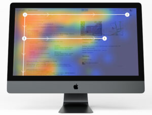
Visual hierarchy is one of the most critical principles behind good web design. It determines the order in which the human eye perceives elements on a webpage. In essence, visual hierarchy guides users’ attention and influences their decision-making process. Creating a strong visual hierarchy is essential for a successful user experience.
While there is no one-size-fits-all approach to building a concrete hierarchy, competitive designers must develop unique methods to stay ahead. The goal is to strategically influence user flow and decisions rather than simply creating a visually pleasing design. Visual hierarchy revolves around capturing users’ attention and drawing their eyes to the most important elements on a webpage.
The elements of visual hierarchy
To establish a strong visual hierarchy, web designers employ various techniques and elements. Let’s explore some of the key factors that contribute to effective visual hierarchy in web design:
1. Size matters
The size of elements on a webpage plays a significant role in attracting attention. Larger elements naturally grab more attention, while smaller elements tend to be perceived as less important. By strategically adjusting the size of different elements, designers can guide users’ focus and highlight essential information.
2. Colour psychology
Colours evoke emotions and convey messages. They can be used to create contrast, highlight important elements, and establish a visual hierarchy. Bright and contrasting colours tend to attract attention, while subdued or harmonious colours can create a more calming effect. Designers can leverage colour psychology to guide users’ attention and emphasise key elements on a webpage.
3. Contrast for impact
Contrast is a powerful tool in visual hierarchy. Using dramatic differences in colour, text size, or font style can draw attention to specific elements. By creating contrast between different sections or elements on a webpage, designers can guide users’ eyes and emphasise important information.
4. Aligning elements
Alignment plays a crucial role in organising information and creating order on a webpage. By aligning elements, designers can establish clear visual relationships and guide users’ attention. Alignment can range from simple distinctions, such as separating content and sidebar columns, to more complex techniques, such as placing important information in the top-right corner, where users expect to find certain elements.
5. The power of repetition
Repetition is a powerful tool in design. Consistency in elements such as typography, colour schemes, and formatting helps users navigate and understand content more easily. By creating repetitive patterns, designers can establish a visual hierarchy and categorise information within a webpage.
6. Proximity and grouping
Proximity refers to the arrangement of elements in close proximity to one another. By grouping related elements together, designers can create sub-hierarchies within a webpage. Proximity also helps users associate similar content and understand the relationships between different elements.
7. Utilising whitespace
Whitespace, or negative space, refers to the empty areas between elements on a webpage. It provides breathing room and helps users navigate content more effectively. By strategically spacing out elements and incorporating ample whitespace, designers can create a sense of clarity and make it easier for users to process information.
8. Stylistic choices
Style and texture can also play a role in visual hierarchy. Designers can use different styles, such as flat or textured backgrounds, to create contrast and emphasise certain elements. However, it’s important to use style judiciously, as excessive use of stylistic elements can overwhelm users and distract from the overall design.
By incorporating these elements and techniques, designers can create a visually appealing and well-structured website that guides users’ attention and enhances their overall experience.
Putting it all together: The user’s journey
 A successful web design goes beyond aesthetics. It’s about creating a seamless user experience and guiding users through the information presented on a webpage. Visual hierarchy serves as a roadmap, leading users from one element to another and ensuring they can easily navigate and understand the content.
To achieve this, web designers must consider the overall flow of information. They can strategically place important elements within the F-shaped scanning pattern, which aligns with users’ natural reading behaviour. By understanding how users perceive and process information, designers can optimise the placement of key content and improve overall engagement.
The hero image, a large and attention-grabbing image placed above the fold, is another effective technique that captures users’ attention and provides a clear overview of a website’s most important content. Inspired by traditional newspaper layouts, the hero image design follows a visual hierarchy that has stood the test of time.
The ever-evolving world of web design
Web design has come a long way since the first web page went live in 1991. Early websites were often cluttered, lacking clear visual hierarchy and overwhelming users with excessive information. Today, designers have learned the importance of creating cohesive and user-friendly designs that prioritise visual hierarchy.
As technology continues to advance and devices come in various screen sizes, web designers must adapt and optimise their designs to provide a seamless experience across all platforms. The expectations of online users are high, and a well-designed website that incorporates visual hierarchy, functionality, and responsiveness is essential for capturing and retaining their attention.
Ready to enhance your website’s visual hierarchy and create a compelling user experience? Contact us today to learn more about our services and the ways in which we can empower your online success.
Let's make a website!
Book a FREE video call to discuss your business, project strategy, and more!
"*" indicates required fields

Can Apple Vision Pro Revolutionise Computing?
Discover the Apple Vision Pro: a mixed-reality headset set to redefine computing, work, entertainment, and education.
How to Choose the Perfect Typography for Your Website
Master the art of web typography... from font selection to readability, create a visually stunning and user-friendly website.

The Power of WordPress for Small Businesses
Build a strong online presence for your small business with WordPress! It's easy to use, SEO-friendly, and very cost-effective.
Celebrating 40 Years of the Apple Mac
Explore 40 years of Mac evolution! Celebrating Apple's iconic computer and its impact on design, technology, and creativity.

Why LinkedIn Should Be Your Top Priority
Maximise career growth with LinkedIn's powerful benefits! Unlock networking opportunities, connect and build your personal brand.
7 Strategies to Build Customer Loyalty
Elevate your brand with proven strategies for customer loyalty. Personalised programs, consistency, and gratitude that resonate.