Let's make a website!
Book a FREE video call to discuss your business, project strategy, and more!
"*" indicates required fields

Can Apple Vision Pro Revolutionise Computing?
Discover the Apple Vision Pro: a mixed-reality headset set to redefine computing, work, entertainment, and education.

The Power of WordPress for Small Businesses
Build a strong online presence for your small business with WordPress! It's easy to use, SEO-friendly, and very cost-effective.
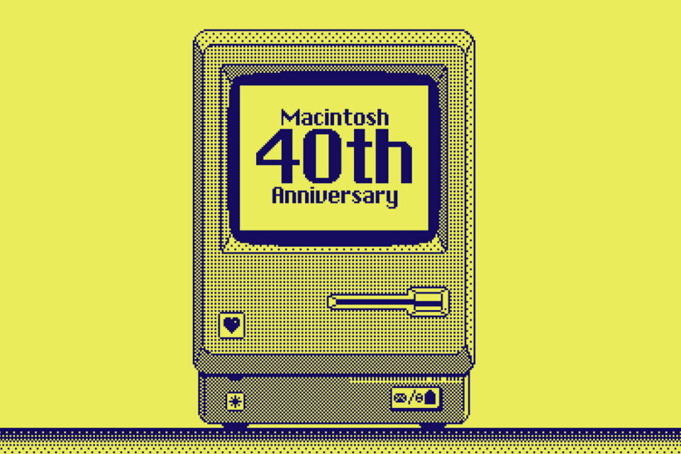
Celebrating 40 Years of the Apple Mac
Explore 40 years of Mac evolution! Celebrating Apple's iconic computer and its impact on design, technology, and creativity.
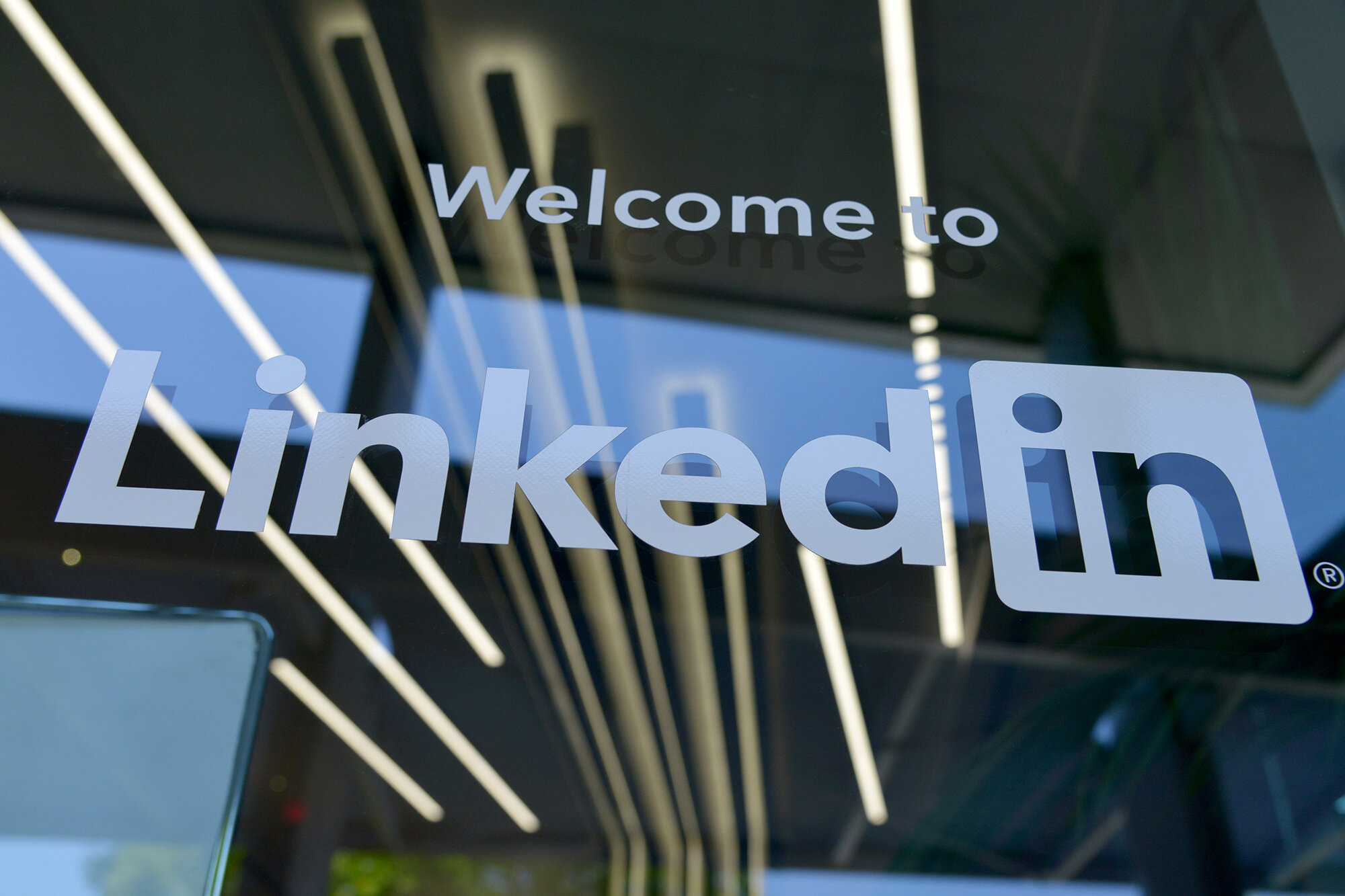
Why LinkedIn Should Be Your Top Priority
Maximise career growth with LinkedIn's powerful benefits! Unlock networking opportunities, connect and build your personal brand.

7 Strategies to Build Customer Loyalty
Elevate your brand with proven strategies for customer loyalty. Personalised programs, consistency, and gratitude that resonate.

Leveraging ChatGPT to Boost Your Conversions
Elevate your copywriting with ChatGPT! Unlock creativity, get audience insights, and optimise content effortlessly.