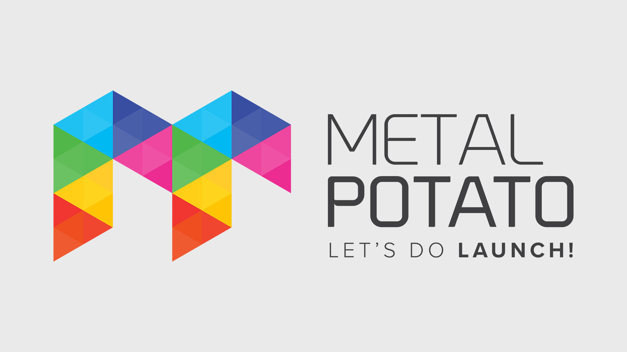
It is with great excitement and a bittersweet nod that we announce a new visual identity for Metal Potato. In the past four years, we’ve grown a lot with our big, multi-coloured M. And we’ve had a ton of fun together. Frankly, there are so many things we love about him—his dimensional triangles, the way a slight symmetry formed above his orange and yellow eyebrows.
But reflecting on our growth since 2005, we realised that the big M was no longer an accurate representation of who we are at Metal Potato. The big M was, well, too big.
So today, we’re here to announce a new logo: the little m.
![]()
The evolution of the Metal Potato logo
Little m is brighter; he’s more approachable and a bit incomplete. Really, we feel that little m says exactly what Metal Potato is about and what we’ve learned through the years.
He says boldly, “Hey! We’re missing a piece, and that piece is you!”
Little m represents a dynamic work of art—your company—that’s missing just one piece—a gorgeous website.
We think our new identity represents a self-awareness of not being the biggest kid on the block, not taking ourselves too seriously, and realising that there’s always room to grow. So if you see a car, lorry, or city-flag flying a tiny, colourful m rest assured that no matter their intentions, they’ve at least got a beautiful website.
This post was updated in 2023. Read more at: Metal Potato launches new USP.
Contact us today to learn more about our services and how we can help you to succeed online.
Let's make a website!
Book a FREE video call to discuss your business, project strategy, and more!
"*" indicates required fields

The Power of Microsites: Driving Results
Boost engagement & brand awareness with microsites! Learn how they enhance marketing efforts & align with SEO strategies.
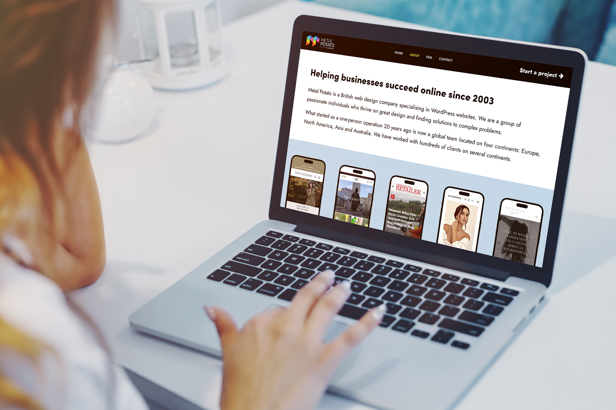
Introducing Metal Potato’s New Website
Introducing Metal Potato's new site. We’ll help launch your website on budget, on message, and on time! Let's do launch!

What Does ‘Let’s Do Launch!’ Mean?
"Let's do launch!" Our promise of on-time, on-budget, and on-message website launches that look amazing on any device.
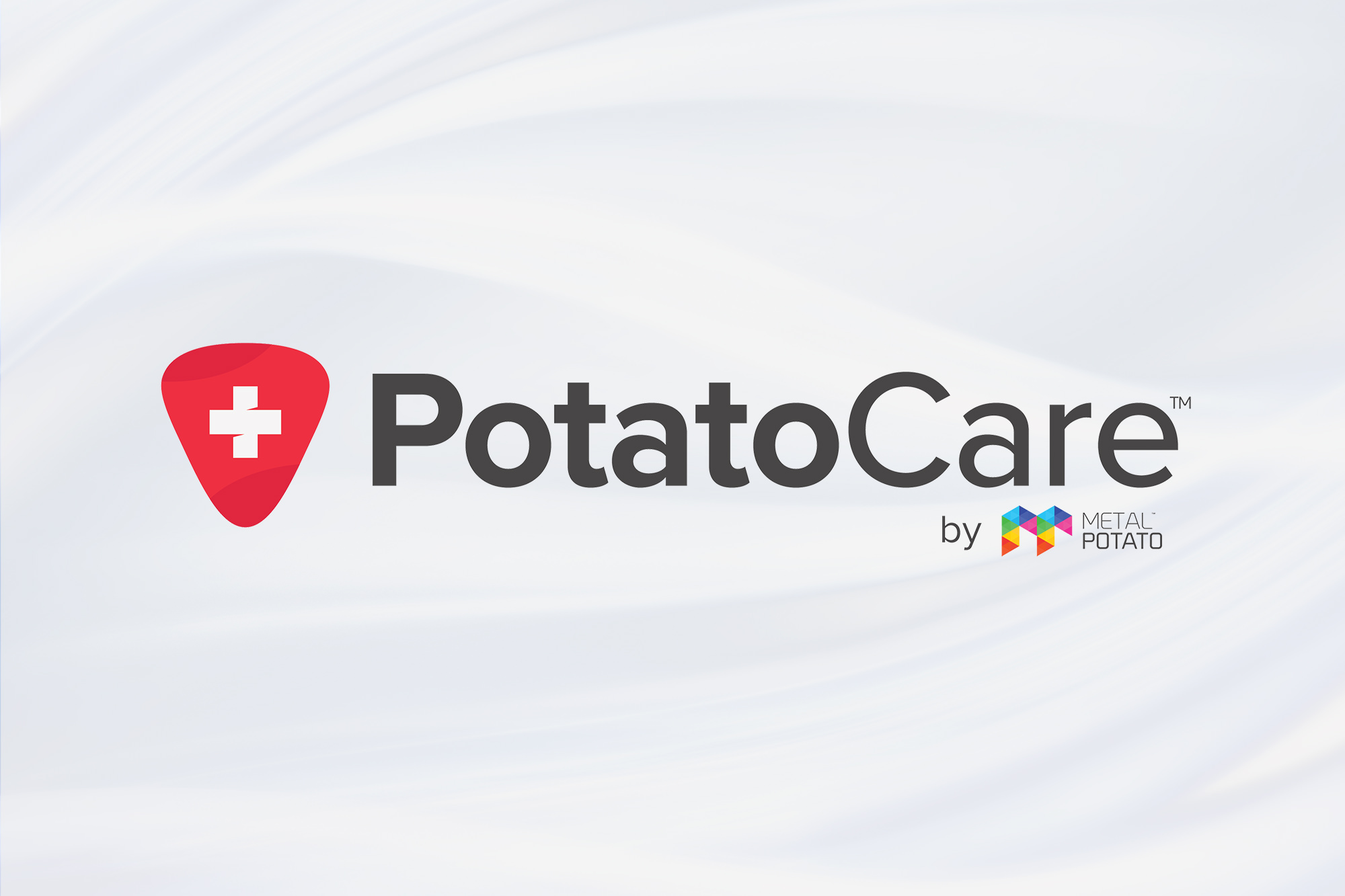
Introducing Potato Care, WordPress Care Plan
Get exceptional WordPress hosting and maintenance with Potato Care. Optimal uptime, security, backups, and support.

Unveiling Our 6-Step Web Design Process
Learn about the 6 crucial steps in our web design process. From strategy to launch, our guide has got you covered.
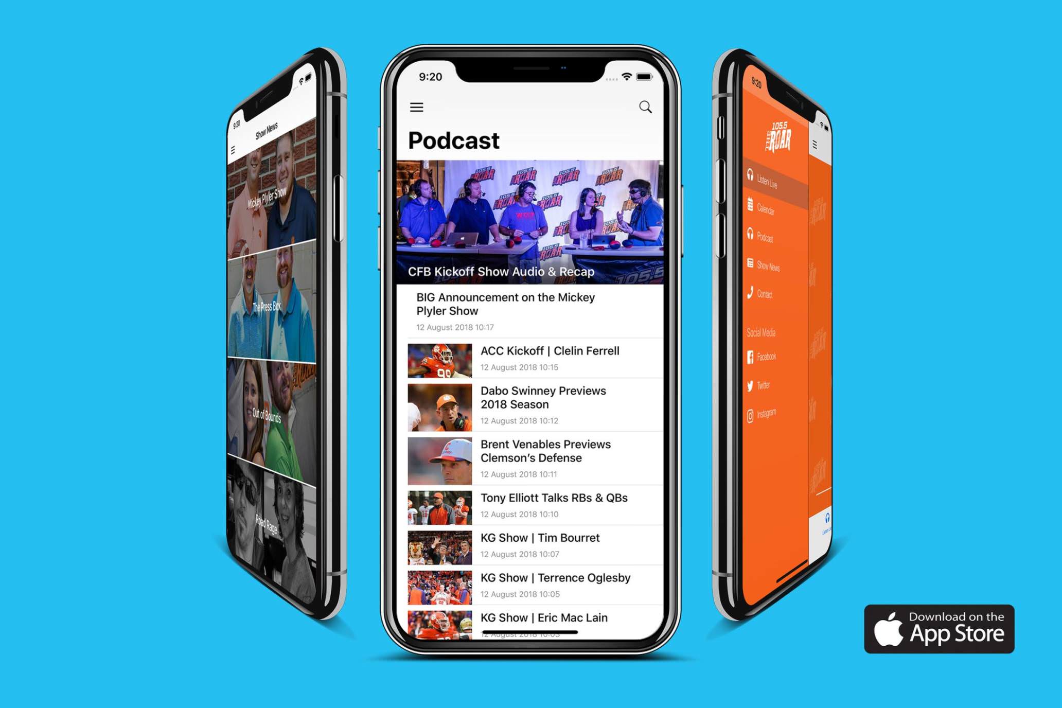
Why We Entered the Mobile App Business
Elevate your online presence with our custom mobile app development services. Let us help your business thrive online.