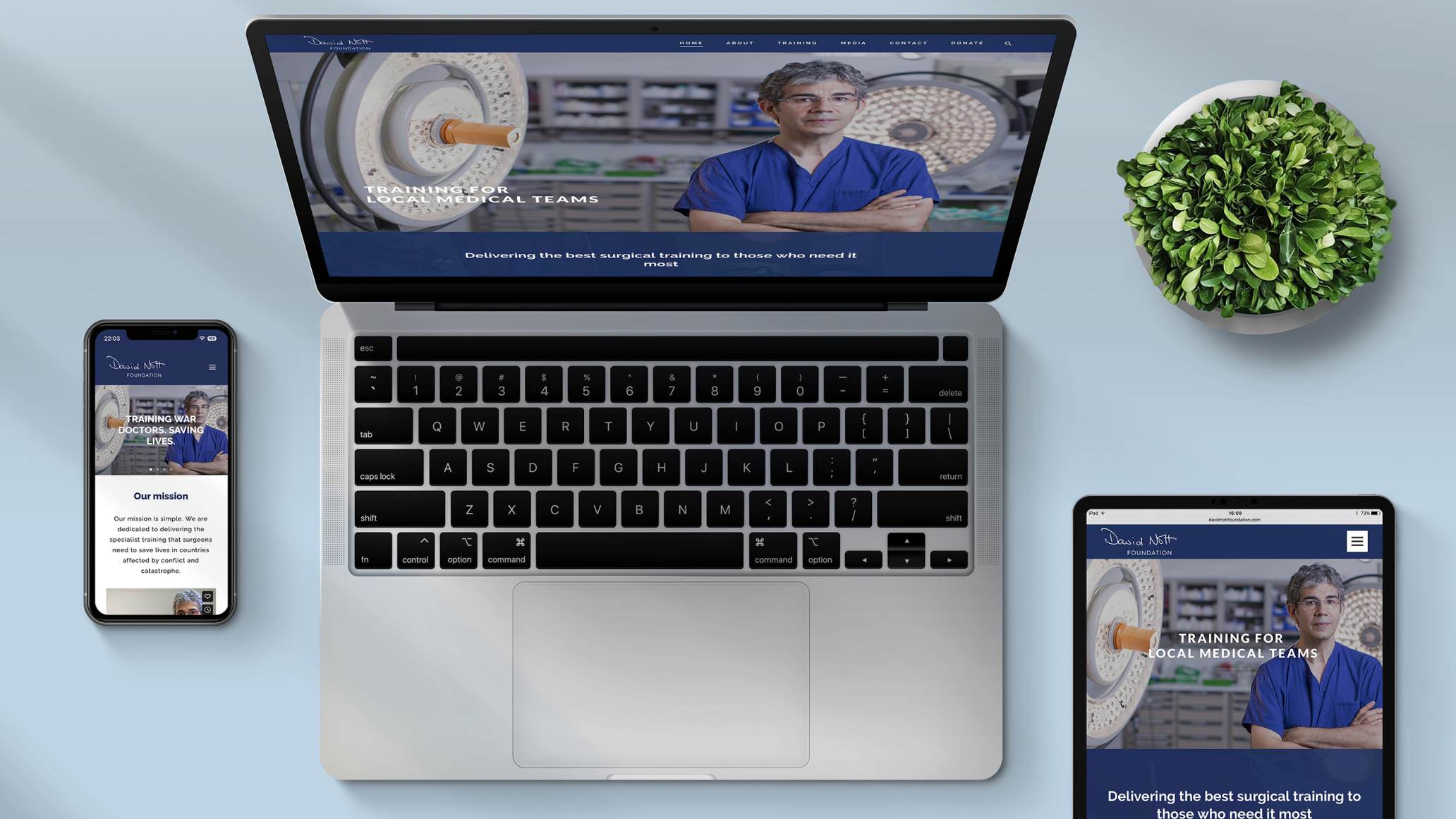
Having a website that caters to the diverse needs of users is no longer a luxury, but an absolute necessity. Enter Responsive Website Design – a revolutionary approach to web design that ensures your website looks and functions seamlessly across various devices, screen sizes, and platforms. Gone are the days of frustrating pinch-to-zoom and aimless scrolling; responsive web design is all about delivering an exceptional user experience, regardless of whether your audience is accessing your site on a desktop, tablet, or smartphone.
Today we’ll dive deep into the world of responsive website design, exploring its origins, benefits, and best practices, as well as providing you with practical tips and insights to help you embrace this game-changing trend and stay ahead of the curve in the ever-evolving digital realm. So, get ready to discover how responsive design can transform your online presence and keep your audience engaged, satisfied, and coming back for more.
The importance of responsive website design
The world has seen a dramatic shift in the way we access and consume information, thanks to the widespread adoption of smartphones and mobile devices. With more people using these devices to access the internet, it is crucial for businesses and organisations to adapt their websites to cater to this ever-growing audience. Responsive website design has emerged as the leading solution to this challenge, as it ensures that websites look and function seamlessly across various devices, screen sizes, and platforms.
Having a responsive website is not only about providing an optimal user experience but also about ensuring that your business remains competitive. With search engines like Google prioritising mobile-friendly websites in their rankings, businesses that fail to adopt responsive design risk losing out on valuable search traffic and potential customers. Furthermore, as consumers increasingly rely on their mobile devices for tasks like online shopping, businesses that do not cater to this audience risk losing valuable sales and revenue.
In essence, responsive design is about future-proofing your website and ensuring that it remains accessible, usable, and enjoyable for your audience, regardless of the devices and platforms they use. By embracing responsive design, businesses can maintain a strong online presence and stay ahead of the curve in the ever-evolving digital realm, ensuring that they remain relevant and competitive in the eyes of their target audience.
Fluid grids, flexible images, and media queries
Responsive website design is built upon three core principles: fluid grids, flexible images, and media queries. These principles work together to create a seamless and adaptable layout that automatically adjusts to different screen sizes and orientations. Let’s take a closer look at each of these principles and how they contribute to the overall functionality of responsive design.
Fluid grids are the foundation of responsive design, as they ensure that the layout of a website adapts to the screen size on which it is viewed. Fluid grids use relative units like percentages to define the width and height of elements on a page, as opposed to fixed units like pixels. This ensures that the layout automatically scales and adjusts to fit different screen sizes, providing an optimal viewing experience across various devices.
Flexible images, also known as adaptive images, are crucial for ensuring that the visual elements of a website scale and resize appropriately as the screen size changes. By using CSS properties like max-width and max-height, images can be set to automatically resize based on the dimensions of their parent containers, ensuring that they do not exceed the available screen space and maintaining the overall integrity of the layout.
Media queries are the final piece of the responsive design puzzle, allowing designers to apply specific CSS styles based on the characteristics of the device or browser on which the website is being viewed. Using media queries, designers can customise the appearance and layout of a website for different screen sizes, resolutions, and orientations, ensuring that the user experience remains consistent and enjoyable across various devices.
Benefits of having a responsive website
There are numerous benefits to having a responsive website, ranging from improved user experience to better search engine rankings. Here are some of the key advantages of embracing responsive design for your website.
- Enhanced user experience: Responsive design ensures that your website looks and functions seamlessly across various devices, providing users with a consistent and enjoyable experience regardless of the device they use. This can lead to higher levels of engagement, satisfaction, and loyalty among your audience.
- Improved search engine rankings: As mentioned earlier, search engines like Google prioritise mobile-friendly websites in their rankings. By adopting responsive design, you can improve your website’s visibility in search results, leading to increased organic traffic and potential customers.
- Cost and time savings: Rather than creating and maintaining separate websites for different devices, responsive design allows you to have a single website that adapts to various screen sizes. This can save you time and resources in the long run, as you only need to update and manage one website.
- Increased conversion rates: Responsive websites are better equipped to cater to the diverse needs of users, which can result in higher conversion rates for businesses. By providing an optimal browsing experience across various devices, you can increase the likelihood of users engaging with your content and ultimately converting into customers.
- Future-proofing your website: As new devices and platforms continue to emerge, having a responsive website ensures that your online presence remains accessible and usable for your audience, regardless of the technology they use.
Responsive design vs. mobile-first design
Responsive design and mobile-first design are two popular approaches to creating websites that cater to the needs of users across various devices. While they share some similarities, there are key differences between the two approaches that are worth understanding.
Responsive design, as discussed earlier, is an approach that focuses on creating websites that automatically adapt and scale to different screen sizes and devices. This approach typically involves designing a website for a desktop environment first and then adjusting the layout and styles to accommodate smaller screens and devices.
Mobile-first design, on the other hand, prioritises the needs of mobile users from the very beginning of the design process. This approach involves designing a website for mobile devices first and then progressively enhancing the layout and features for larger screens and devices. Mobile-first design is based on the principle that it’s easier to scale a design up for larger screens than it is to scale it down for smaller devices.
Both approaches have their merits, and the choice between them largely depends on the specific needs and goals of your website. However, with the increasing importance of mobile devices in today’s digital landscape, many designers and developers are embracing the mobile-first approach as a way to ensure that their websites cater to the needs of the largest possible audience from the outset.
Best practices for creating a responsive website
Creating a responsive website involves more than just implementing fluid grids, flexible images, and media queries. To ensure that your website delivers an optimal user experience across various devices, it’s essential to follow a set of best practices that address both design and technical considerations. Here are some key best practices to keep in mind when creating a responsive website.
- Keep your design simple and clean: A cluttered and overly complex design can hinder the effectiveness of your responsive website. Keep your design simple and clean, focusing on the most important elements and functionality that will provide value to your users. This will make it easier for your website to adapt to different screen sizes and devices.
- Optimise for performance: The performance of your website is crucial for ensuring a positive user experience, particularly on mobile devices where network speeds can be slower and less reliable. Optimise your website’s performance by compressing images, minifying CSS and JavaScript files, and using caching techniques to reduce load times and improve overall responsiveness.
- Design for touch: With the majority of users accessing websites on touch-enabled devices like smartphones and tablets, it’s essential to design your website with touch in mind. Ensure that your website’s interactive elements are large enough and spaced appropriately for easy tapping, and consider implementing touch-specific features like swiping and pinch-to-zoom where appropriate.
- Implement responsive navigation: Navigation is a crucial aspect of any website, and it’s even more important on smaller screens where space is limited. Implementing responsive navigation that adapts to different screen sizes is essential for ensuring that users can easily access all areas of your website, regardless of the device they use. This can include techniques like collapsible menus, slide-out menus, and dropdown menus.
- Test your website across devices: Testing your website across different devices and platforms is essential for ensuring that it delivers an optimal user experience. Use tools like Google’s Mobile-Friendly Test and BrowserStack to test your website on a wide range of devices and browsers, and make any necessary adjustments to ensure that your website is accessible and usable for all users.
Common challenges and solutions in responsive design
Responsive website design can present a range of challenges, particularly for those with limited web design experience. Here are some common challenges and solutions to keep in mind when implementing responsive design.
- Content and layout: One of the biggest challenges in responsive design is ensuring that your content remains accessible and readable across various devices and screen sizes. To address this challenge, focus on creating a clear and concise layout that prioritises the most important information and functionality. Use responsive typography and flexible grids to ensure that your content remains readable and accessible across all devices.
- Images and media: Images and media can present challenges in responsive design, particularly when it comes to ensuring that they scale and resize appropriately across various devices. To address this challenge, use adaptive images that automatically resize based on their parent containers and consider using responsive embeds for media like videos and audio.
- Navigation: Navigation can be challenging in responsive design, particularly on smaller screens where space is limited. To address this challenge, consider using responsive navigation techniques like collapsible menus, slide-out menus, and dropdown menus. Ensure that your navigation is easy to access and use, regardless of the device or screen size.
Embracing responsive design for the future
Responsive design is a game-changing trend in web design, offering numerous benefits and advantages for businesses and organisations of all sizes. By embracing responsive design, you can future-proof your website, enhance user experience, and stay ahead of the curve in the ever-evolving digital realm. At Metal Potato, we specialise in creating fully responsive WordPress websites that deliver exceptional user experiences across various devices and platforms.
With our expertise and experience, we can help you take your online presence to the next level and ensure that your business remains competitive and relevant in today’s digital landscape. Get in touch to learn more about our responsive web design services and how we can help you achieve your business goals.
Let's make a website!
Book a FREE video call to discuss your business, project strategy, and more!
"*" indicates required fields
More from Metal Potato
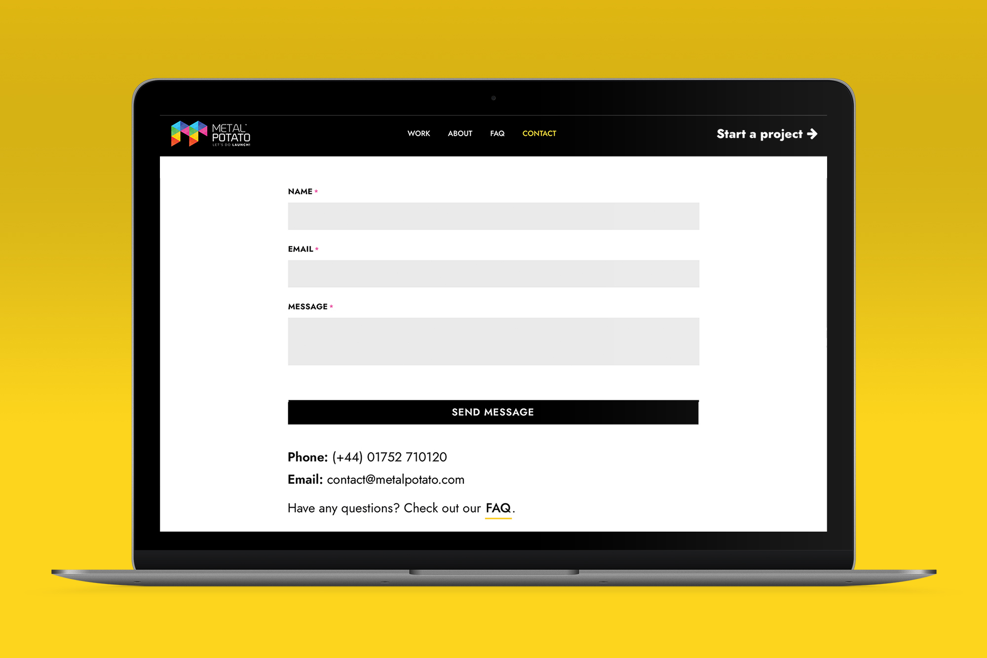
Contact Page Design: A Blueprint for Success
Learn how to optimise your contact page for better engagement and conversions with expert tips and inspiring examples.

Can Apple Vision Pro Revolutionise Computing?
Discover the Apple Vision Pro: a mixed-reality headset set to redefine computing, work, entertainment, and education.
How to Choose the Perfect Typography for Your Website
Master the art of web typography... from font selection to readability, create a visually stunning and user-friendly website.

The Power of WordPress for Small Businesses
Build a strong online presence for your small business with WordPress! It's easy to use, SEO-friendly, and very cost-effective.

Celebrating 40 Years of the Apple Mac
Explore 40 years of Mac evolution! Celebrating Apple's iconic computer and its impact on design, technology, and creativity.

Why LinkedIn Should Be Your Top Priority
Maximise career growth with LinkedIn's powerful benefits! Unlock networking opportunities, connect and build your personal brand.