CASE STUDY
How a responsive web design transformed Made in the Cellar's online business
Made in the Cellar needed a mobile-friendly web design to showcase their unique upcycled products and facilitate online sales, but faced delays due to life events.
CASE STUDY:#144COMPANY:Made in the CellarDATE:2017DELIVERABLES:Design, Development, Support & Maintenance
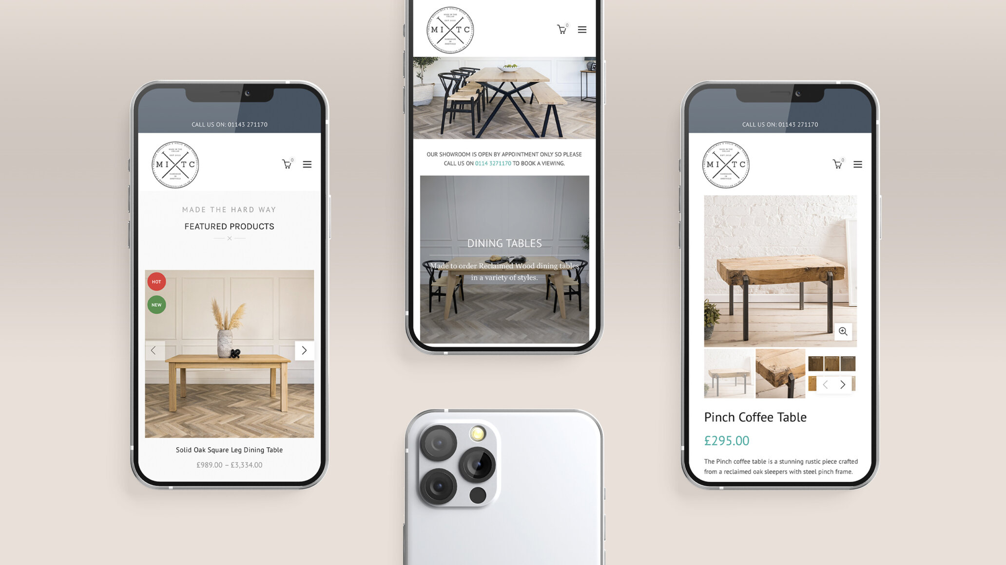
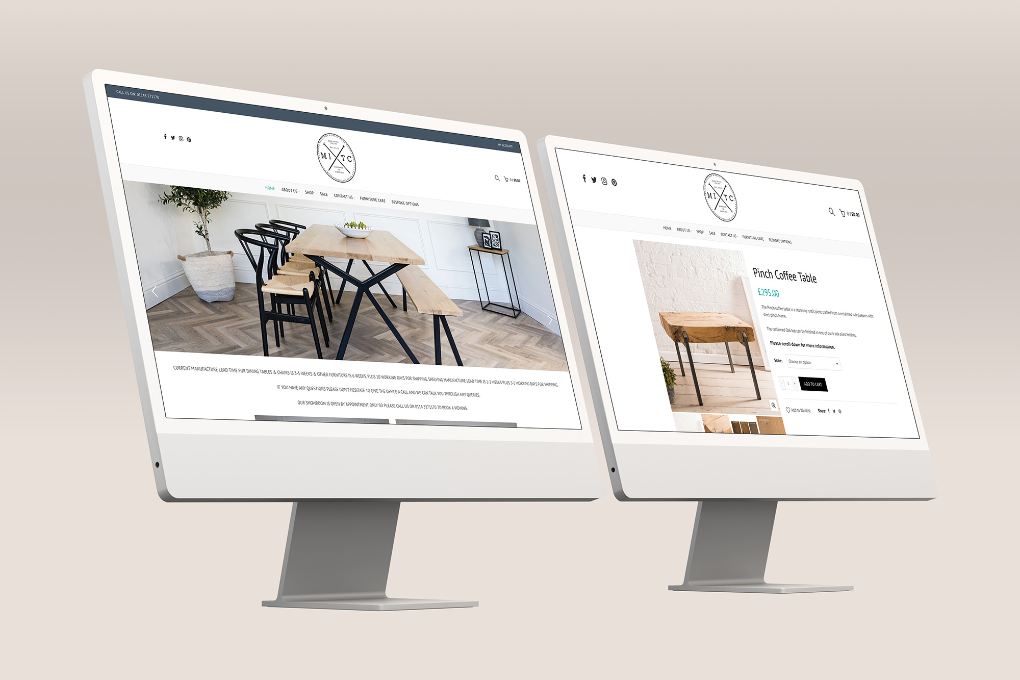
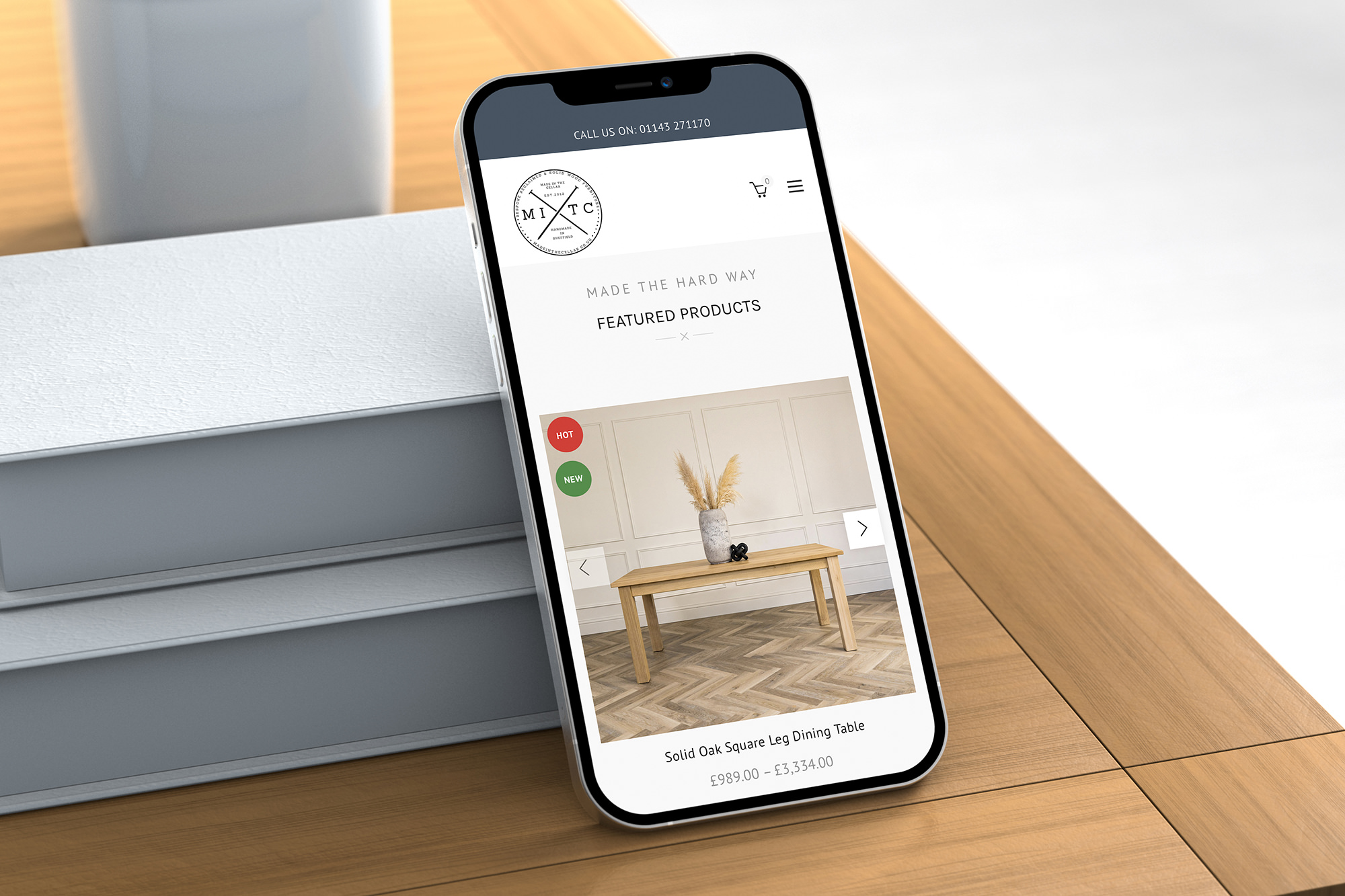
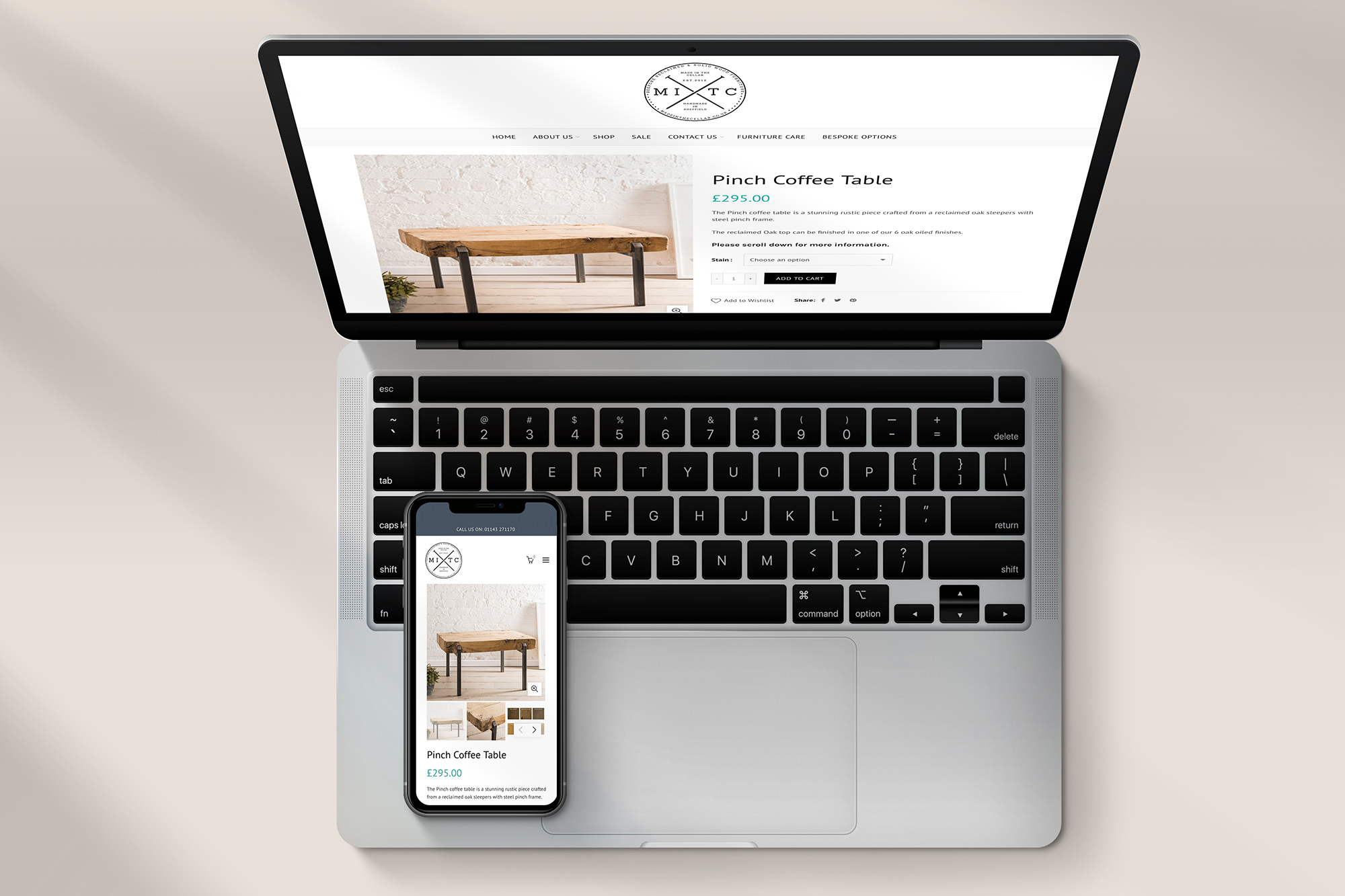
From delayed dreams to digital success
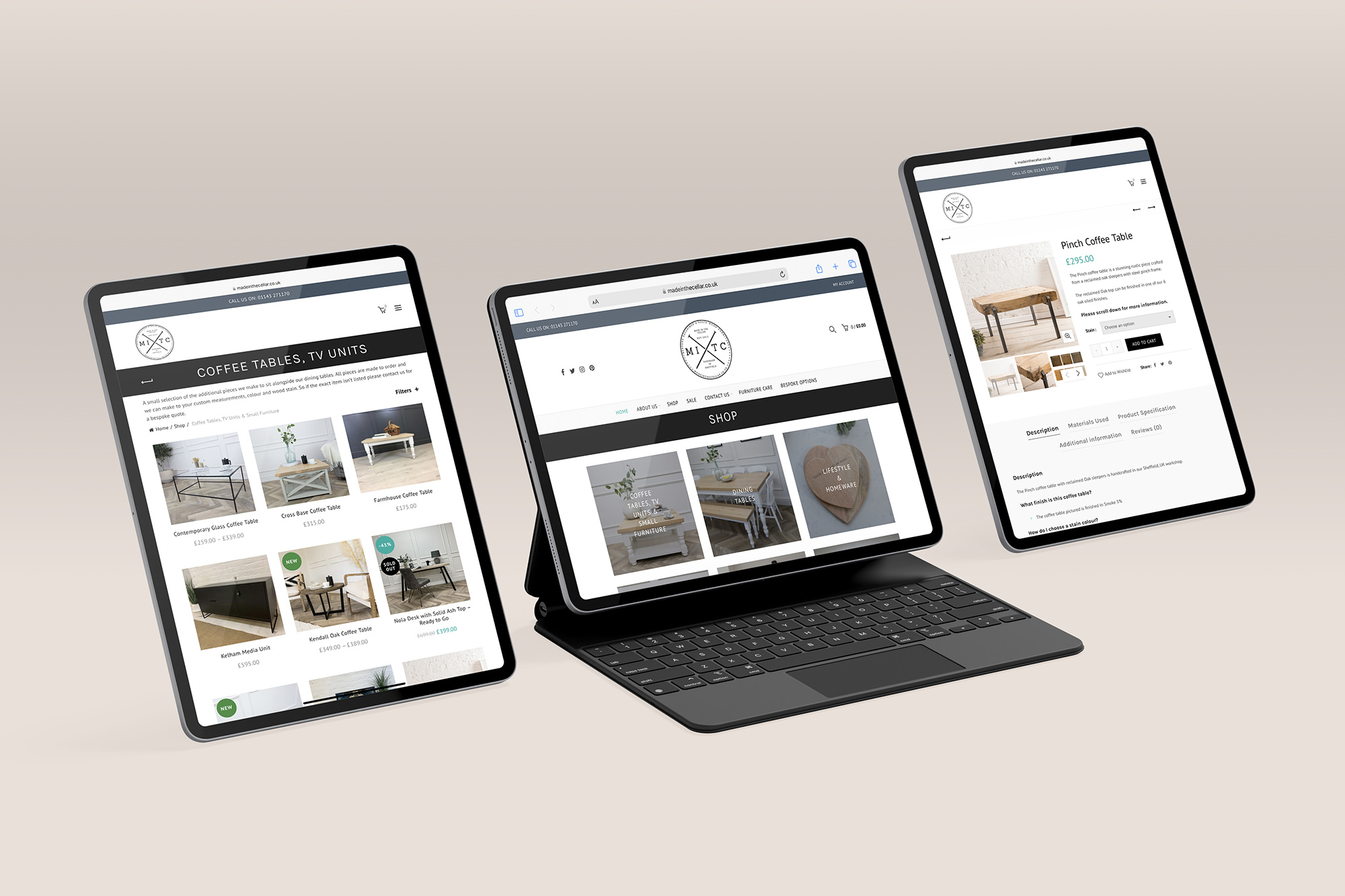
Made in the Cellar first approached us for a mobile-friendly web design at the dawn of the responsive age, way back in 2013. At the time, Nikki’s new business was just getting rolling—and we were, too. Her Made in the Cellar concept of “up-cycling” endearing and eclectic products was taking off, and we were keen to build a fully-functional eCommerce platform for her. But as life goes, things get in the way. Nikki soon welcomed two new additions to the family—and before we could blink, three years had flown by.
Luckily, in that time, both Metal Potato and Made in the Cellar grew exponentially. And we were happy to develop an all-new responsive website tailor-made for the changes in web design that were going on while her children were growing up a bit.
Now, at the start of 2017, we’re happy to say “welcome to the family” to Nikki. And we’re thrilled to come full circle on an elegant, responsive web design for Made in the Cellar.
Andrew has been great to work with from the beginning. Nothing is ever too much trouble and he’s very prompt at responding to my queries. I cannot fault Metal Potato’s service and highly recommend them!
Nikki Duncombe — Founder, Made in the Cellar